This is the new look of Scrite as of version 0.4.0 Beta.
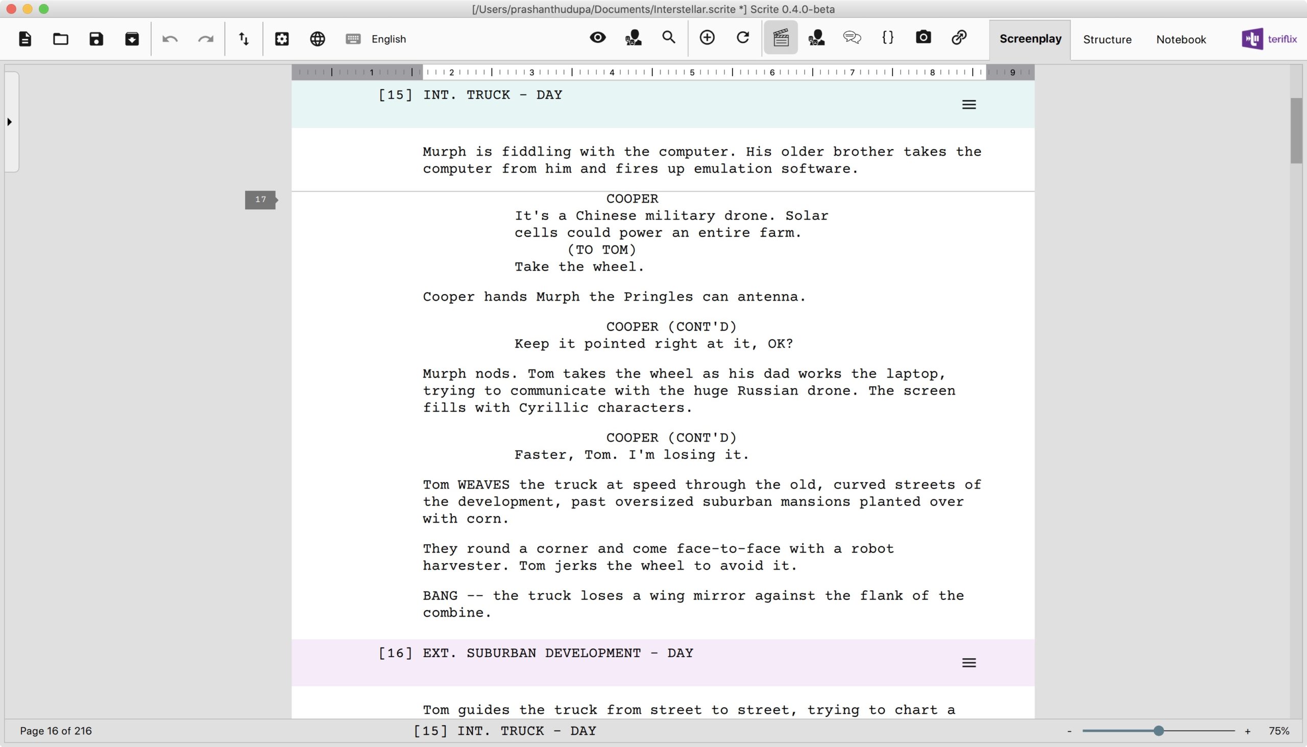
The new UI is minimalistic. It is clean and less crowded. It’s focus is entirely on the writing area, which is what one would expect from a screenplay writing app. If you want to first put the latest version of the app for download before reading the rest of this post, we wouldn’t blame you.
Download Scrite 0.4.0 Beta from here.
Coming back to the new UI Design: this was contributed by Surya Vasishta. Some of you would know him as the maths teacher from Director Roopa Rao’s Gantumoote. You may have also heard that he is now donning the writer & director’s hat to direct actor Shruthi Hariharan‘s comeback film. We got to know recently that he was a UI designer in the past.
He has been very supportive of the effort behind Scrite, ever since we released our first beta. In the recent past, he reached out to us offering to contribute UI design. We sat down for a Zoom call about a week or so ago and he went over some of the UI designs he had made for Scrite using Photoshop. By the time we spoke, we already had progressed with the new screenplay editor and preview feature. Surya included all of our progress into his new design suggestions and we absolutely loved what he came up with. We decided to accept his suggestion and go implement it. We discussed a lot more than just UI design and have some exciting new ideas for the future. But for now, only the UI design has come to life. Finally, Scrite got some attention from the “eye of a UI designer”.
In this post we will outline some of the key changes to the UI.
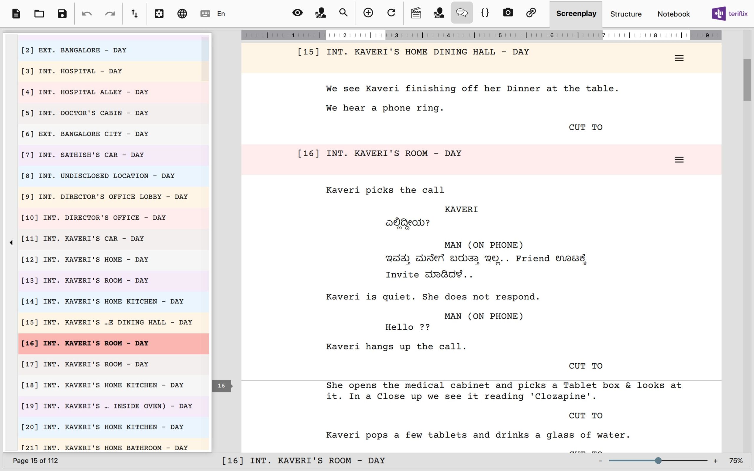
The Tab Bar
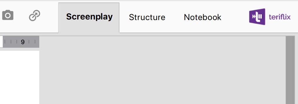
In the new version, the tab bar has blended with the application toolbar, thereby giving us a lot of additional space in the document area. This means a writer can see more of his work, rather that the UI.
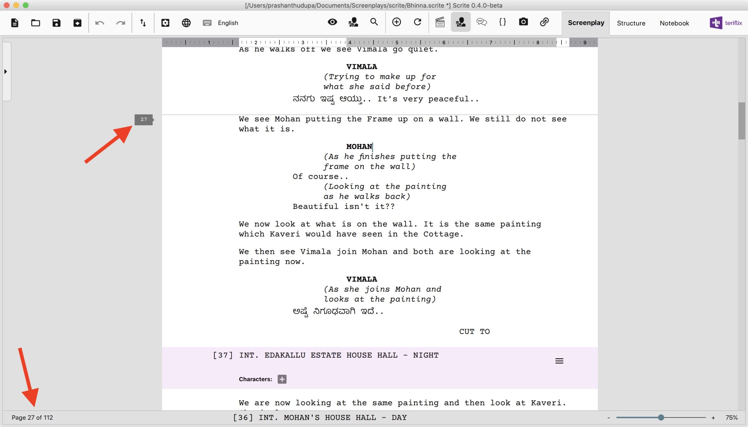
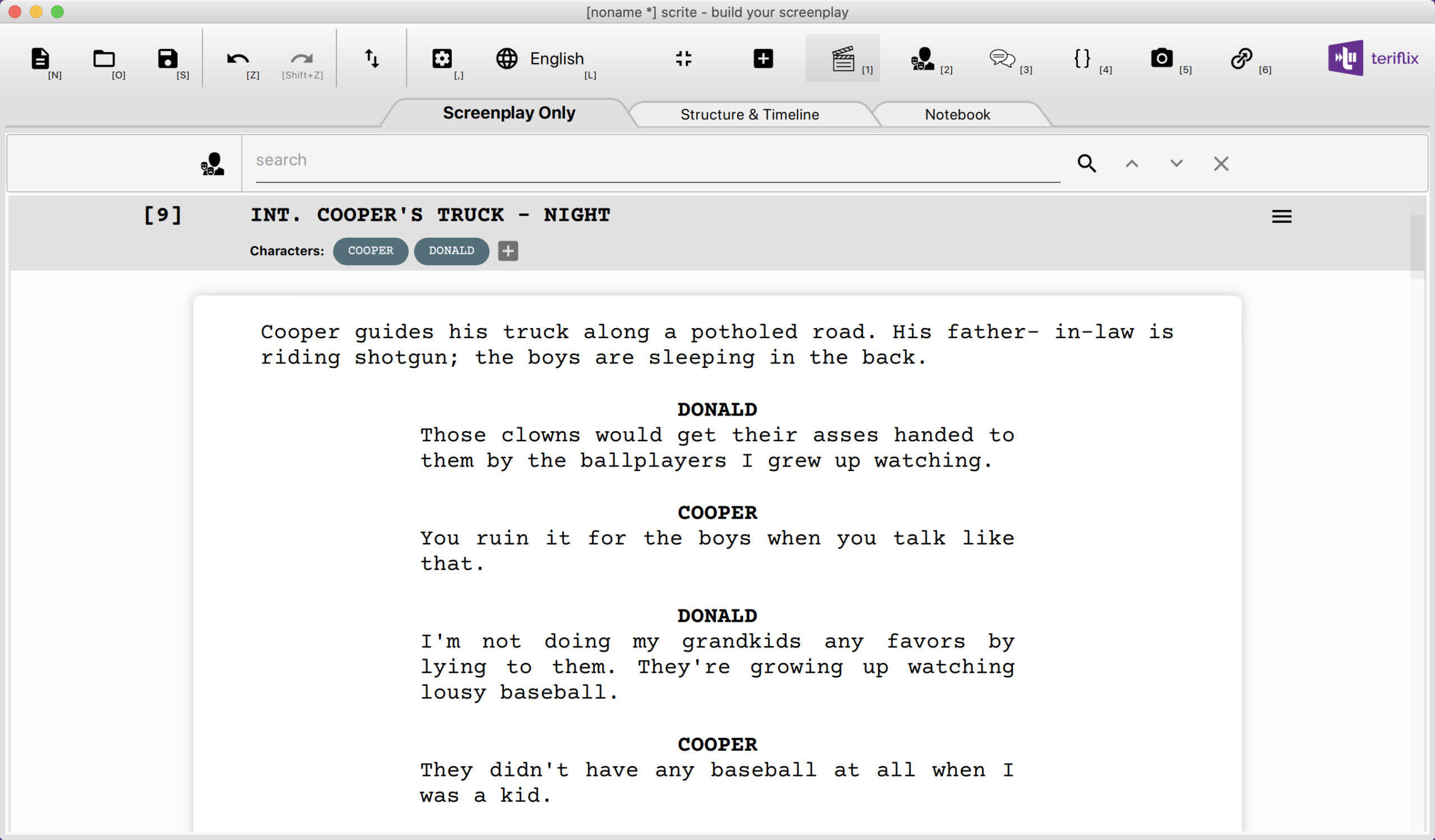
Screenplay Editor Toolbar
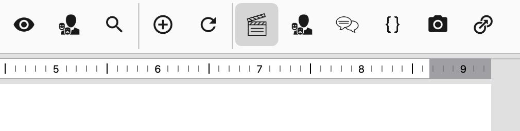
All the screenplay editing tools are right next to the tabs on the main toolbar. The formatting options become enabled when the cursor is in the screenplay editor. Other buttons are described below.
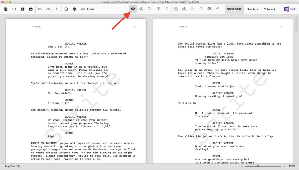
Screenplay Preview
With 0.4.0, Scrite can now show you a preview of your screenplay right inside the app. Previously you would have had to generate a PDF file for this. Now, you can simply preview your screenplay by clicking on the preview button in the toolbar.
Scene Characters Menu
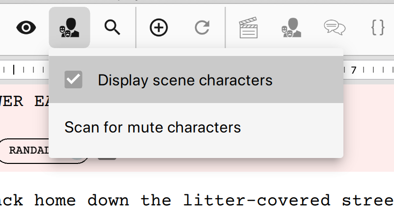
The Scene Characters Menu is now triggered in response to a button the toolbar. This button used to be within the screenplay editor area, but it has now moved into the toolbar. This makes more space available for the screenplay editor.
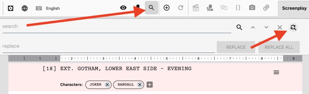
Find & Replace
Previously we would show the find & replace bar on the screenplay editor irrespective of whether the writer was using it or not. That’s wastage of screen real estate. The find and replace option is now tucked away and is brought forward whenever the find button on the toolbar is clicked.
With all these changes, the screenplay editor area now has 20% more space than it had in 0.3.8 Beta.
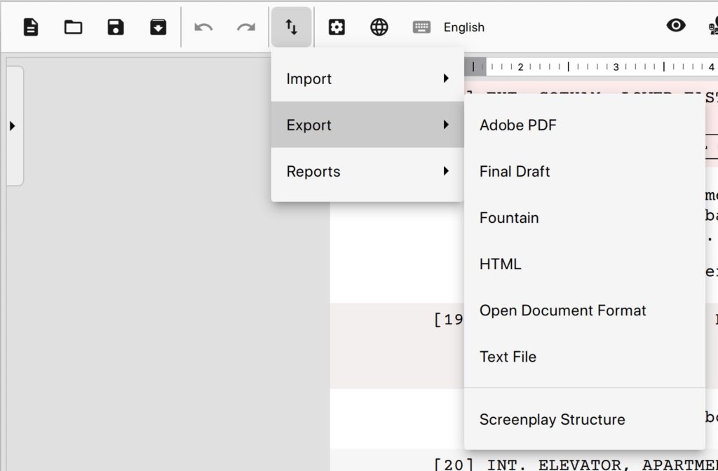
New, Open, Save, Import, Export & Settings
These buttons are now on the top left of the window.
Scene List
The screenplay editor now sports a new panel called “Scene List”. As the name suggests it is a list of scenes in your screenplay. It helps you to quickly navigate through scenes while you are writing. You can click on the panel icon towards the left edge of the screenplay editor to pull the scene list out.
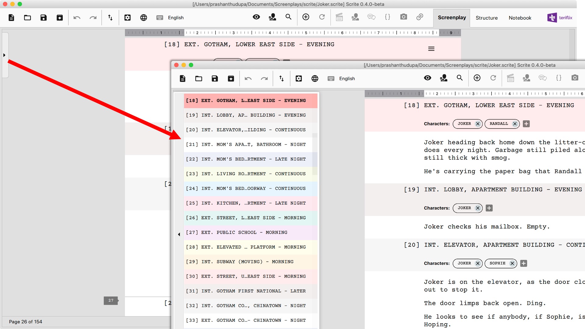
You can single click on any scene in the list to quickly make that scene current in the screenplay editor. Double clicking on a scene in the list will make it current and also collapse the panel.
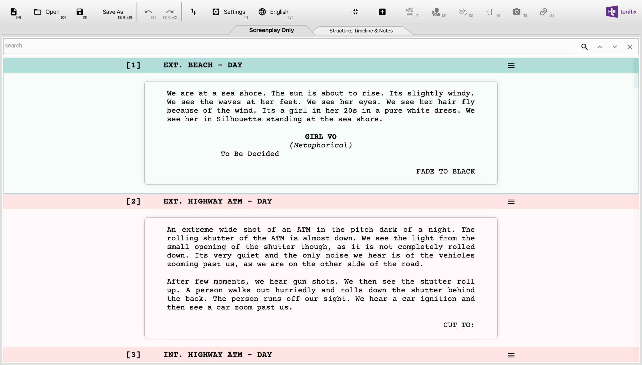
Page Boundaries
Scrite now displays page boundaries as you type and even shows page numbers within the screenplay editor area.
The page boundaries shown as overlays in the screenplay editor, along with the page number and page count are updated as you type.
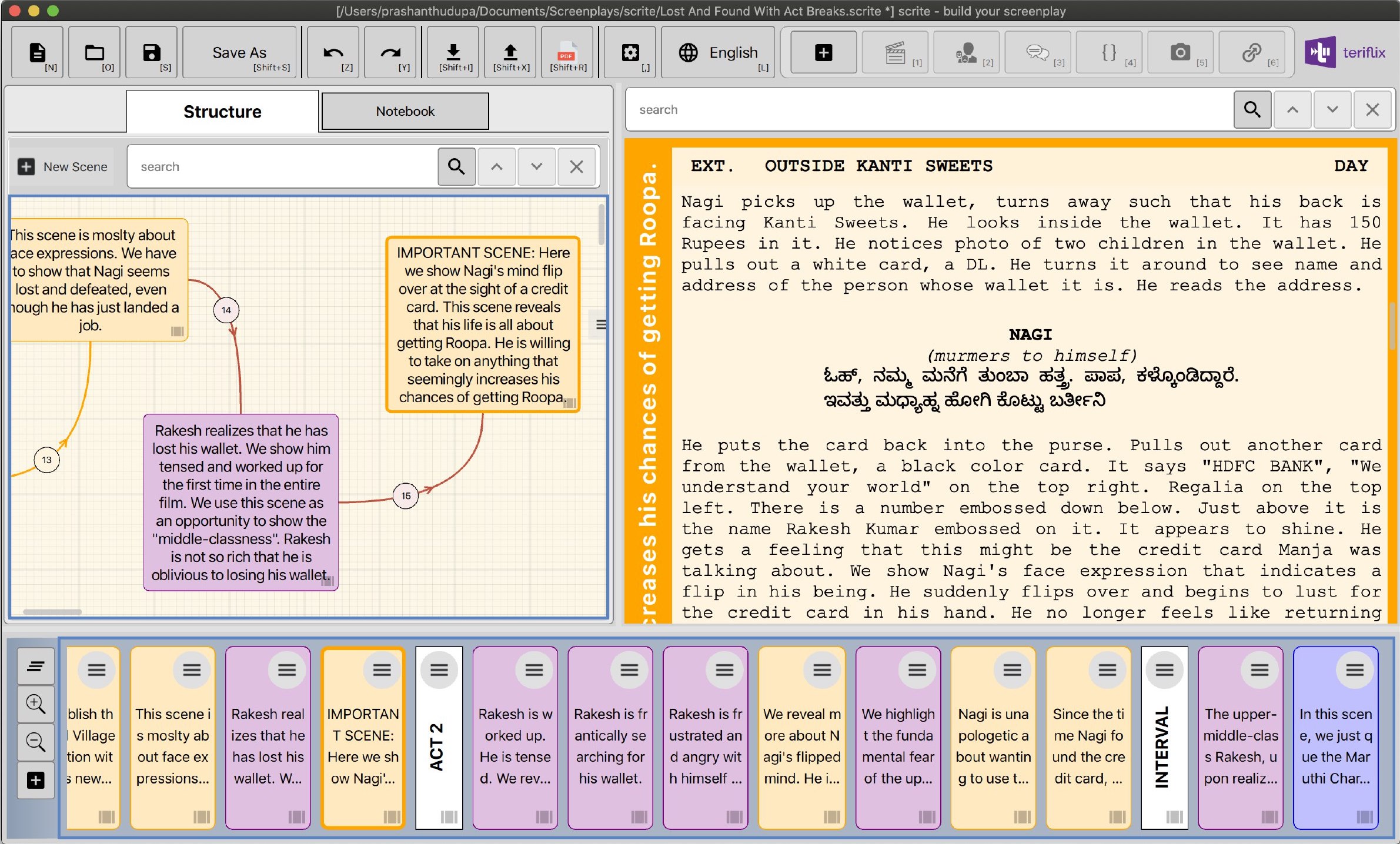
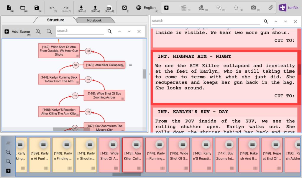
Structure and Timeline
The structure and timeline panels now have a tab of their own.
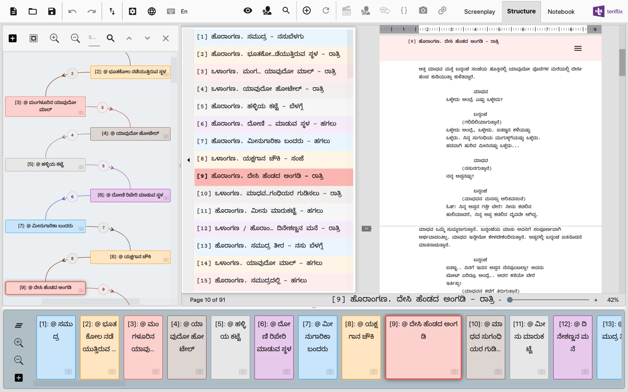
Notice how the scene & screenplay editor in the structure tab now uses the new Screenplay Editor with industry standard formatting. While editing a scene, you can now see exactly how many pages the scene would span, thereby get a better sense of how big your scene is turning out to be.
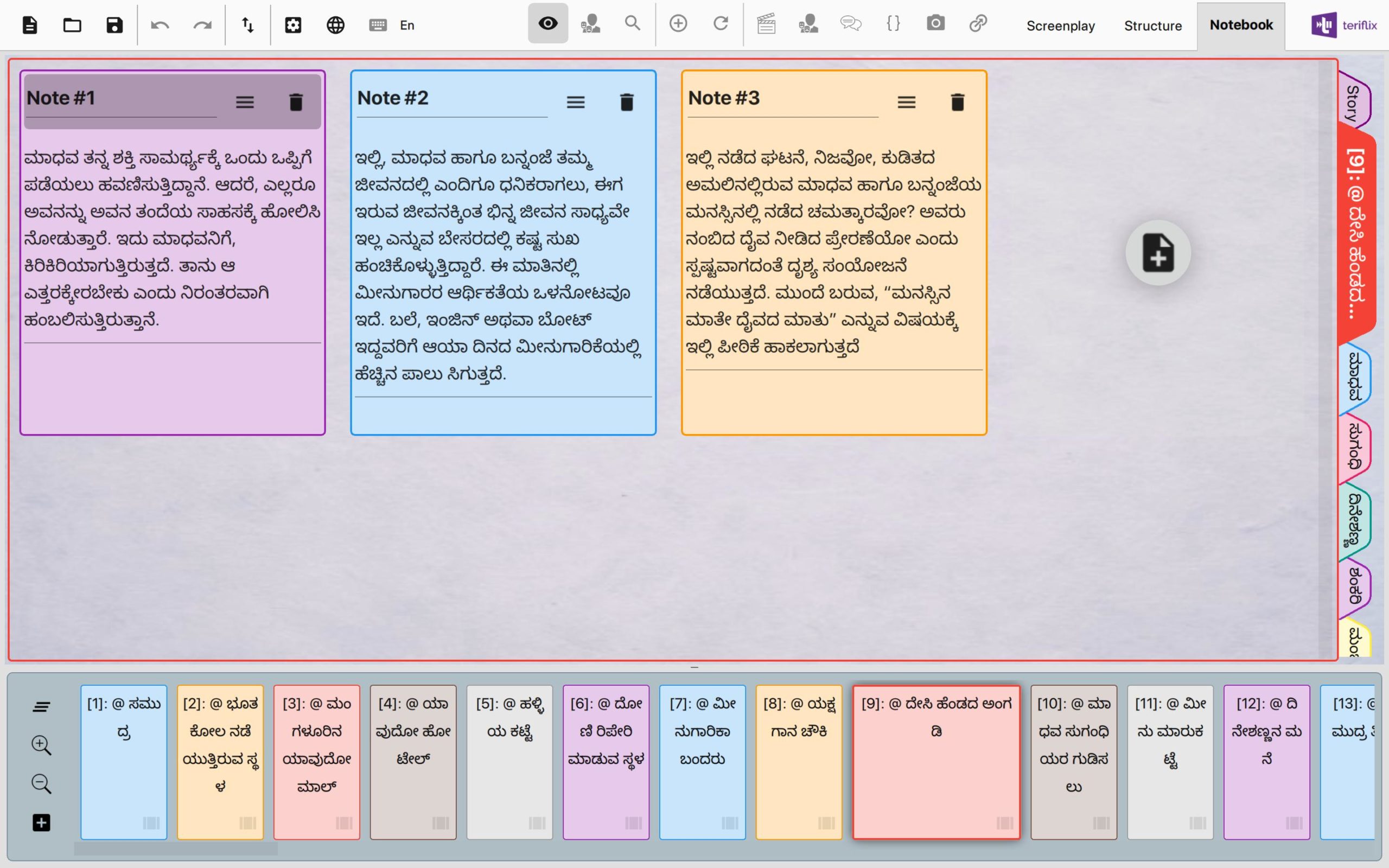
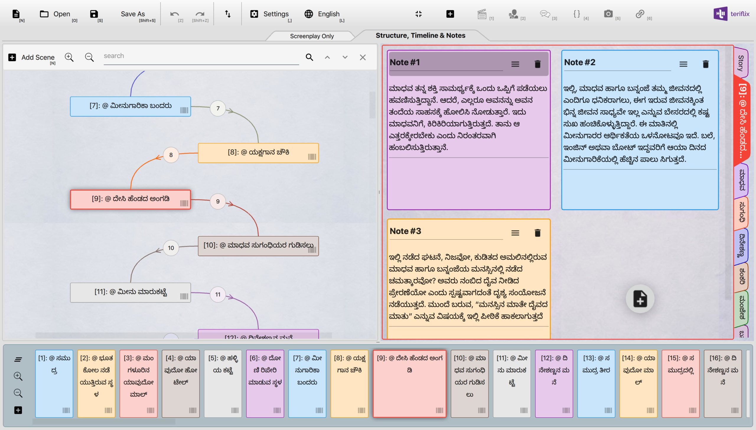
Notebook Tab
The notebook also has a tab of its own.
Did you like the new UI? Are there things you would want to tweak? Let us know your feedback here. We respond to each and every feedback, but sometimes it takes a while for us to revert. We are a small team and are juggling between many things at the moment. But we absolutely appreciate your feedback.
This is just the beginning. There is more UI polish coming to Scrite in the coming updates as we make the app more feature rich and stable.
Nostalgia
As we write about all this, we cant help but get nostalgic about the journey of Scrite. If you have some time to gloss over how much Scrite has progressed since its first public beta release, read on.
When we released the first public beta of Scrite, this is how it looked.
The first beta sported a very rustic, boxy look. While it served the purpose of writing, it was not inspiring to use and operate. Clearly the app had no attention from UI & UX designer.
While many of our early adopters liked intention of the app, they hated its look and feel. We did not have any UI & UX designer on the team, so we were clueless how to address look-and-feel issues.
We started by addressing a few things in the app: starting with colors and sharp corners. In a few weeks we had our next update, which looked better.
Still the look and feel was far from ideal. Looking back, we can clearly notice how the colors in the UI were so much “in your face”.
Over a period of time, we toned down the colors and cleaned up a lot of UI.
From the beginning, the core feature of Scrite was the Structure & Timeline bits. Which is why they occupied so much of the user interface. But many writers who tried out Scrite in the beginning told us that that they would much rather have a full width writing area where they can just write, before playing around with the structure and timeline. Which is why the structure, timeline and notebook went into a secondary tab.
Version 0.2.8 Beta was the first version which got us a lot of users. Until then we hardly had 20-30 users. With this version, we got a hundred more.
Still, we kept getting critical feedback about the look and feel. However, even the harshest of critics told us that they find the app inspiring even though it was not polished. Some of our early adopters started sharing snippets of their work with us. We were obviously thrilled to see writers enjoying their use of Scrite.
By 0.3.x beta, we had several more features built into the screenplay editor that got a lot of users to stand up and take notice.
Since 0.3.6 Beta, we started getting feedback from professional writers regarding the lack of industry standard screenplay formatting. Although our mentors Director Abhaya Simha and Director Adarsh Eshwarappa were always pointing it out to us, we never thought that it would be a deal breaker. With 0.3.7 and 0.3.8 betas, we got a resounding feedback from writers – INDUSTRY STANDARD FORMATTING SUPPORT. With Scrite 0.4.0, we now have that in place.
We have come a long way, only to know that the way ahead is much longer. Thanks to all the feedback from early adopters, timely advise from mentors and now from contributors like Surya Vasishta.
Keep your feedback coming, that’s the only way for us to progress. We respond to each and every feedback, but sometimes it takes a while for us to get back. We are a small team and are juggling between many things at the moment. But we absolutely appreciate your feedback.